今年的 What’s New in UIKit Session 主要包括以下几个方面
- 生产力提升
- 控制增强
- API 改进
- UIKit 与 SwiftUI 混编
我按照业务理解和适配进度的优先级,对 session 内容进行了重新排序和整理,对 @ferhanakkan 的仓库进行了一些改动,以下为我的总结。
https://github.com/iamStephenFang/WhatsNewInUIKit
API 改进
在 iOS 16 中部分 API 废弃,需要开发者进行适配,同时有一些新能力可以实现。
UIDevice
-
为了防止用户留下指纹,
UIDevice.name现在会报告模型名称而非用户自定义的设备名称。 使用自定义名称需要获得授权。// iOS 16 之前 (e.g. "My iPhone") // iOS 16 (e.g. "iPhone 13") UIDevice().name -
不再支持
UIDevice.orientation, 应使用UIViewController相关API, 如preferredInterfaceOrientation来获取应用界面的预期呈现方向。// UIDeviceOrientation(rawValue: 0) -> .unknown UIDevice().orientation // UIInterfaceOrientation(rawValue: 1) -> .portrait (iPhone) UIViewController().preferredInterfaceOrientationForPresentation
UIScreen
iOS 16 为 配备了 M1 芯片的 iPad 以及 Mac 带来了 Stage Manager (台前调度)功能,作为应用开发者无需对代码进行改动即可适用该功能。
💡 在 iOS 13 前开发单窗口的 App,由
UIApplication负责 App 状态,UIApplicationDelegate(AppDelegate)负责 App 事件和生命周期,然而这种模式不适用于开发多窗口的 iPad App 或 Mac Catalyst App。 iOS 13 引入了构建多窗口应用的UIScene,并对功能职责进行了重新拆分,将 UI 相关的状态、事件和生命周期交与UIWindowScene和UIWindowSceneDelegate(SceneDelegate)负责,UISceneSession负责持久化的 UI 状态。
如果仍在使用旧版本的 UIScreen API,有必要迁移到新的 UITraitCollection 和 UIScene API
UIScreen.main已废弃,需要使用(UIApplication.shared.connectedScenes.first as? UIWindowScene)?.screen- UIScreen 生命周期通知废弃,包括
didConnectNotification、didDisconnectNotification,需要使用UIScene相关方法
自适应大小 cell
UICollectionView 和 UITableView 的 cell 支持了自适应调整大小能力。控制自适应调整大小的是 selfSizingInvalidation 属性,默认开启。
class UICollectionView {
		// Default is .enabled
    var.selfSizingInvalidation: SelfSizingInvalidation
}

@available(iOS 16.0, *)
    public enum SelfSizingInvalidation : Int, @unchecked Sendable {

        /// No updates will take place when -invalidateIntrinsicContentSize is called on a self-sizing cell or its contentView.
        case disabled = 0

        /// Calling -invalidateIntrinsicContentSize on a self-sizing cell or its contentView will cause it to be resized if necessary.
        case enabled = 1

        /// Calling -invalidateIntrinsicContentSize on a self-sizing cell or its contentView will cause it to be resized if necessary, and
        /// any Auto Layout changes within the contentView of a self-sizing cell will automatically trigger -invalidateIntrinsicContentSize.
        case enabledIncludingConstraints = 2
}- 若使用了
UIListContentConfiguration配置cell,每当 cell 的配置发生更改时会自动执行 invalidation。 - 若不使用
UIListContentConfiguration配置cell,可以调用 cell 的invalidateIntrinsicContentSize方法手动执行 invalidation。 - 若使用 Auto Layout 布局cell,可以通过设置
selfSizingInvalidation属性为enabledInclingConstraints来使其接收 Auto Layout 变更。即当 cell 检测到 contentView 内部的任何自动布局变化时,将自动调用invalidateIntrinsicContentSize方法。
默认情况下 cell 自适应调整大小会伴随着动画,可以在 invalidateIntrinsicContentSize 方法外包一层 performWithoutAnimation 从而取消调整大小时的动画。
@objc private func didTapCollapseButton() {
        label.text = Constants.shortText
    }

@objc private func didTapCollapseWithoutAnimationButton() {
        label.text = Constants.shortText
        UIView.performWithoutAnimation {
            self.invalidateIntrinsicContentSize()
        }
    }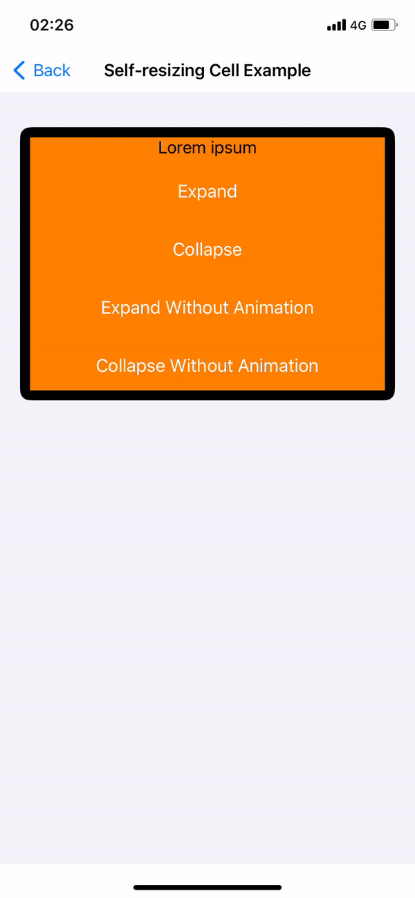
UICollectionView 和 UITableView 将 cell 自适应大小的 invalidation 行为智能合并处理,并在最佳时间执行更新。
UISheetPresentationController
在 iOS 15 上苹果推出了表单展示控件,可以通过简单的代码 present 出 .medium() 和 .large() 两种大小的底部表单。
// on iOS 15
let vc = UINavigationController(rootViewController: DemoViewController())
if let sheet = vc.sheetPresentationController {
		sheet.detents = [.medium(), .large()]
}
self.present(vc, animated: true)
用户可以通过拖拽的方式实现高度的切换,但是当时底栏不具备自定义高度的能力。
在 iOS 16 上苹果开放了 UISheetPresentationController.Detent.Identifier 提供了自定义的能力。
可以简单返回一个常量值或最大高度的百分比来控制表单高度。
@MainActor open class Detent : NSObject {
        open class func medium() -> Self
        open class func large() -> Self

        @available(iOS 16.0, *)
        open var identifier: UISheetPresentationController.Detent.Identifier { get }
    }

// Create a custom detent
sheet.detents = [
    .large(),
    .custom { context in
        0.3 * context.maximumDetentValue
    }
]
更标准的做法是通过自定义 identifier 定制表单展示控件的高度。
// Define a custom identifier
extension UISheetPresentationController.Detent.Identifier {
    static let small = UISheetPresentationController.Detent.Identifier("small")
}

// Assign identifier to custom detent
sheet.detents = [
    .large(),
    .custom (identifier: .small) { context in
        0.3 * context.maximumDetentValue
    }
]

// Disable dimming above the custom detent
sheet.largestUndimmedDetentIdentifier = .small
在使用的过程总需要注意表单展示控件高度不包含 SafeAreaInsets,计算布局时需要注意。
UI 控件
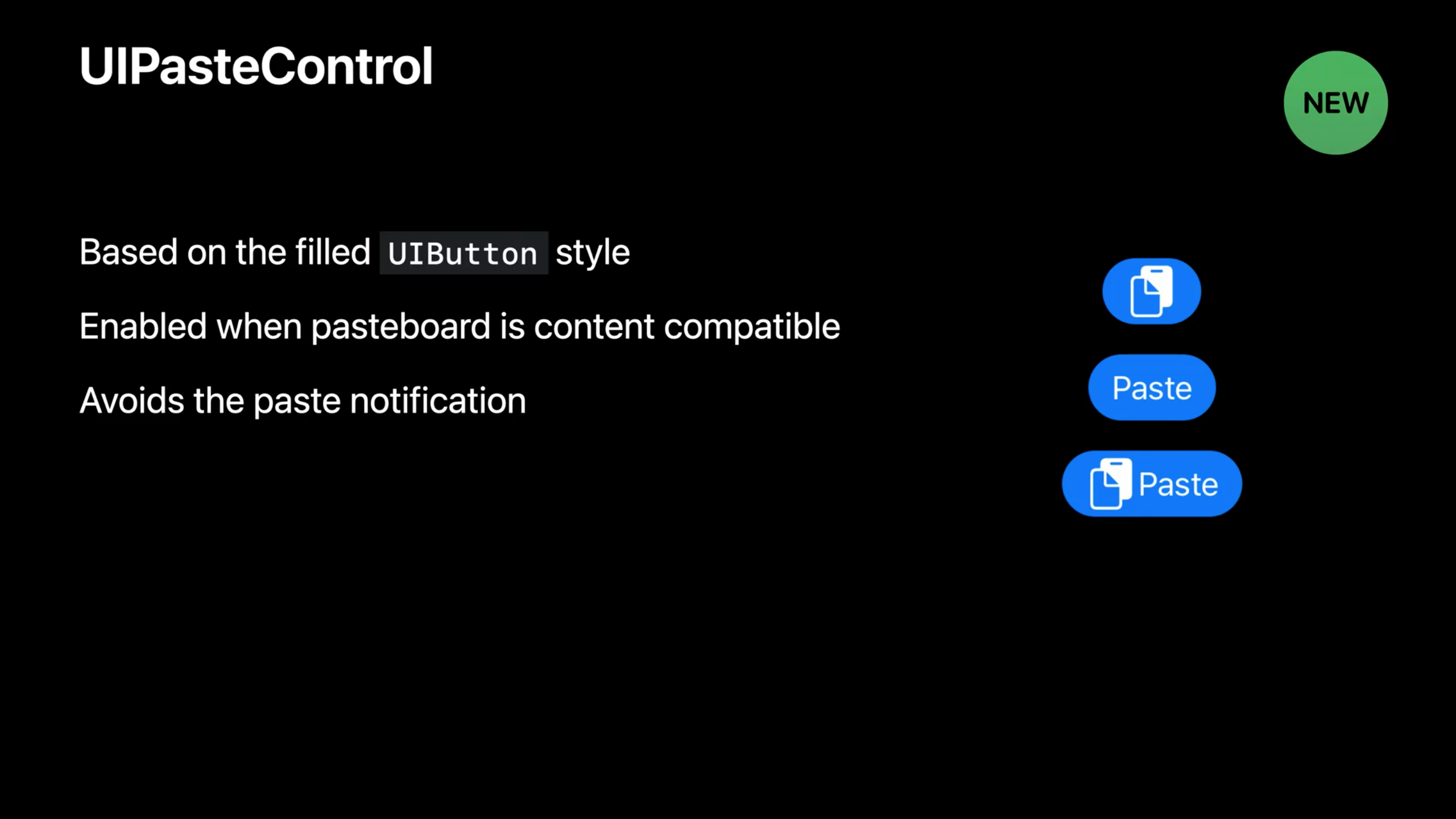
UIPasteControl
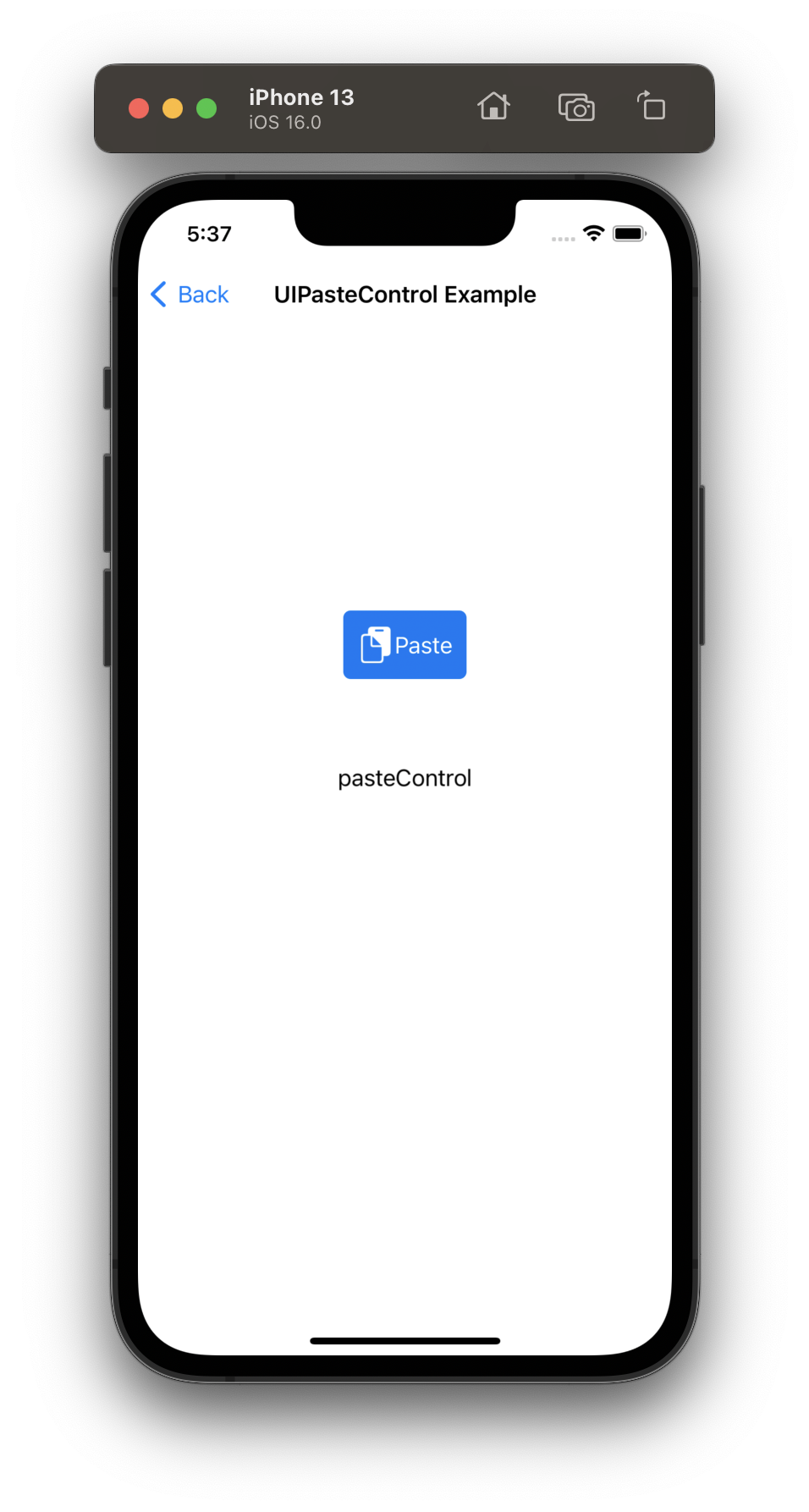
在 iOS 16 前在 app 内执行复制粘贴操作会在顶部显示banner,在 iOS 16上 banner 被 alert 所取代。仍然由系统自动提示,根据用户的选项允许剪贴板内容访问。
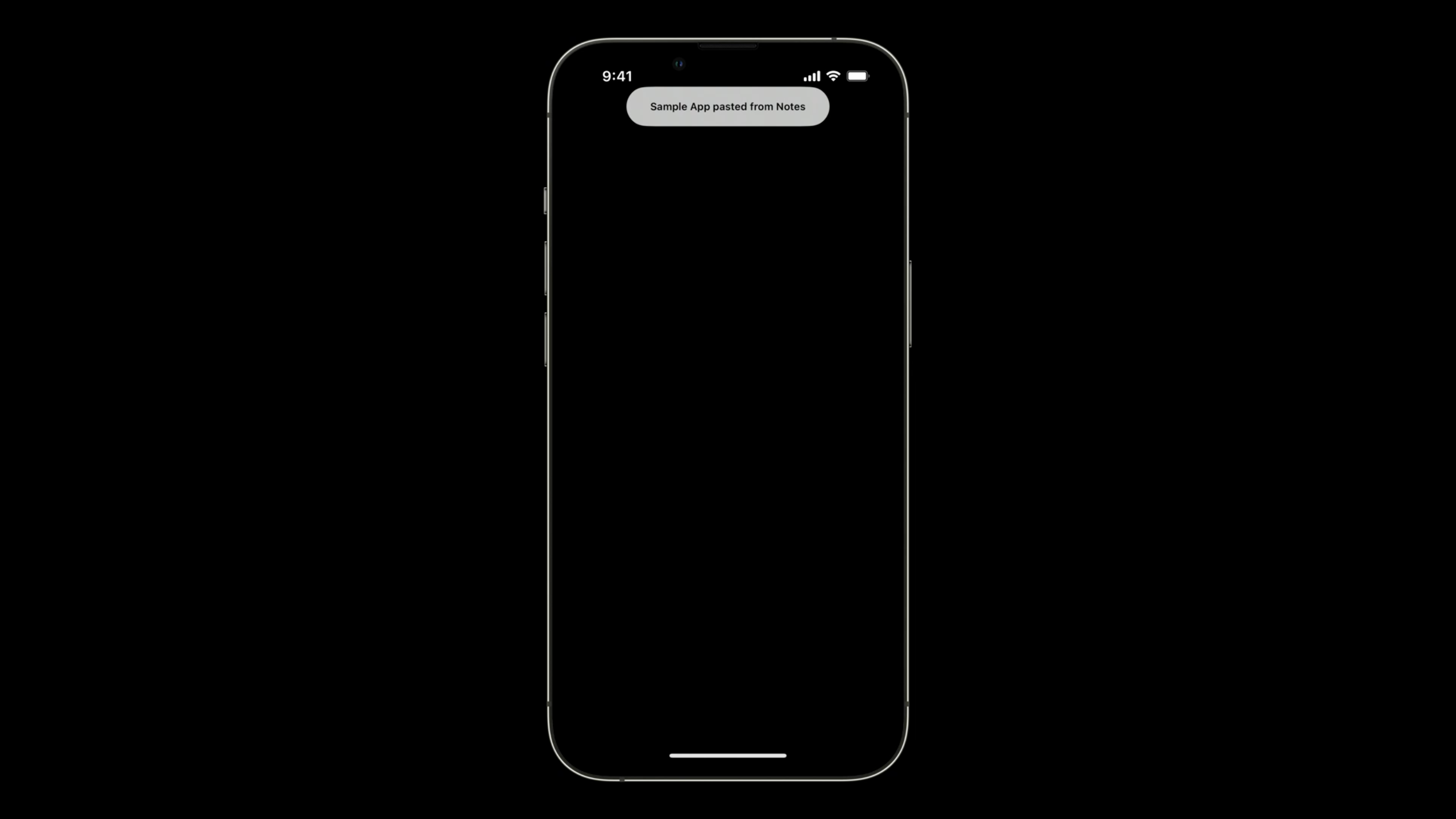
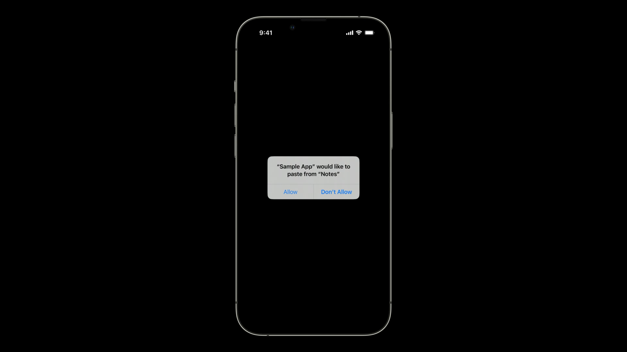
开发者可以用新加入的 UIPasteControl 作为粘贴控件替换这个 alert,可以在这里找到相关文档。
fileprivate lazy var pasteControl: UIPasteControl = {
        let pasteControlConfig = UIPasteControl.Configuration()
        pasteControlConfig.baseBackgroundColor = .systemBlue
        pasteControlConfig.baseForegroundColor = .white
        pasteControlConfig.cornerRadius = 5.0
        pasteControlConfig.displayMode = .iconAndLabel

        let pasteControl = UIPasteControl(configuration: pasteControlConfig)
        pasteControl.target = self
        return pasteControl
    } ()

// MARK: UIPasteConfigurationSupporting

    override func canPaste(_ itemProviders: [NSItemProvider]) -> Bool {
        return true
    }

    override func paste(itemProviders: [NSItemProvider]) {
        if let itemProvider = itemProviders.first {
            if itemProvider.canLoadObject(ofClass: NSString.self) {
                itemProvider.loadObject(ofClass: NSString.self) { (text, error) in
                    if text != nil {
                        DispatchQueue.main.async {
                            self.label.text = text as? String
                        }
                    }
                }
            }
        }
    }
这个适配虽然达成了必须有用户交互才能读取剪贴板的目的,但也等来了一些开发者的吐槽。
https://twitter.com/cyanapps/status/1535187013611438081
UIPageControl
UIPageControl 在 iOS 16 上得到了增强,主要包括以下两点
-
可以针对不同的选中状态展示不同的图像
/// The preferred image for the current page indicator. Symbol images are recommended. Default is nil. /// If this value is nil, then UIPageControl will use \c preferredPageIndicatorImage (or its per-page variant) as /// the indicator image. @available(iOS 16.0, *) open var preferredCurrentPageIndicatorImage: UIImage? -
可以设置布局方向为水平或垂直
/// The layout direction of the page indicators. The default value is \c UIPageControlDirectionNatural.
    @available(iOS 16.0, *)
    open var direction: UIPageControl.Direction

@available(iOS 16.0, *)
    public enum Direction : Int, @unchecked Sendable {


        /// Page indicators are laid out in the natural direction of the system locale.
        /// By default, this is equivalent to @c UIPageControlDirectionLeftToRight on LTR locales, and
        /// @c UIPageControlDirectionRightToLeft on RTL locales.
        case natural = 0

        /// Page indicators are laid out from left to right.
        case leftToRight = 1

        /// Page indicators are laid out from right to left.
        case rightToLeft = 2

        /// Page indicators are laid out from top to bottom.
        case topToBottom = 3

        /// Page indicators are laid out from bottom to top.
        case bottomToTop = 4
    }
GitHub上的 @ferhanakkan 提供了以下 Demo。
private lazy var pageControl: UIPageControl = {
        $0.backgroundColor = .orange
        $0.layer.cornerRadius = 8
        $0.layer.masksToBounds = true
        $0.currentPage = .zero
        $0.numberOfPages = collectionViewData.count
        $0.direction = .leftToRight
        $0.preferredIndicatorImage = UIImage(systemName: "star")
        $0.preferredCurrentPageIndicatorImage = UIImage(systemName: "star.fill")
        $0.translatesAutoresizingMaskIntoConstraints = false
        return $0
    }(UIPageControl())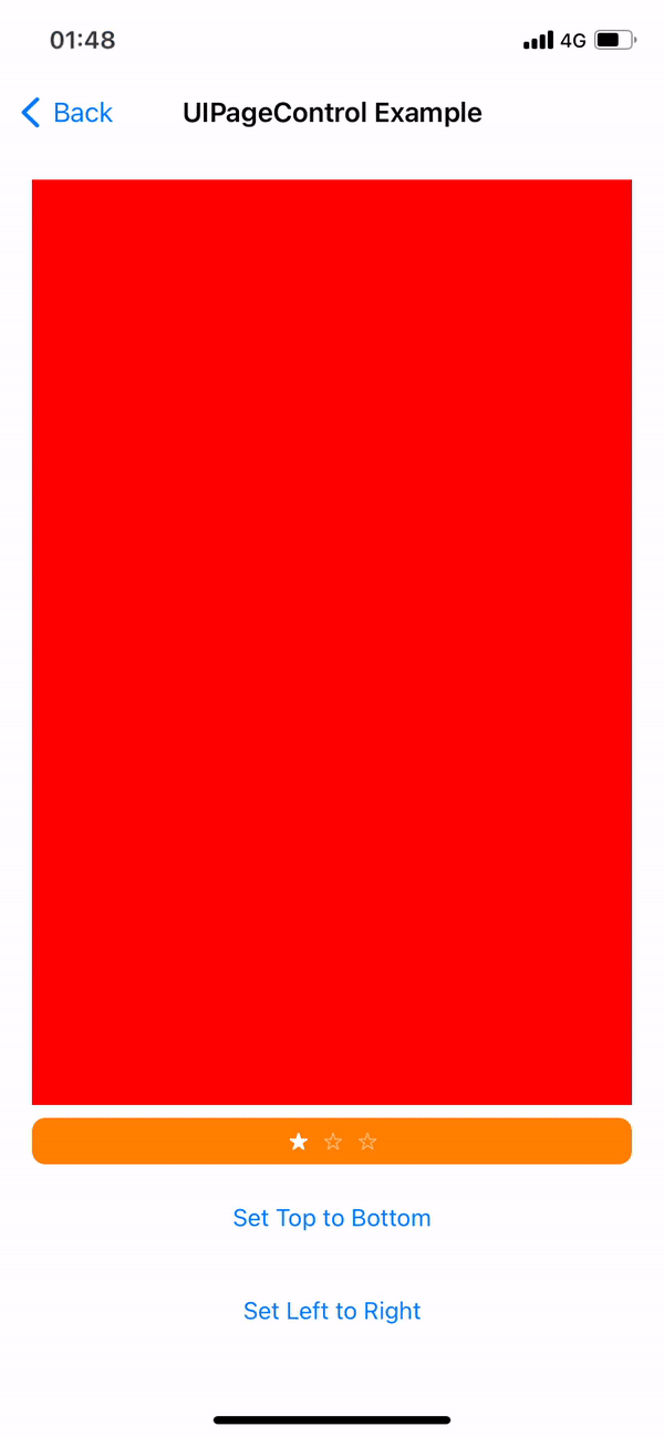
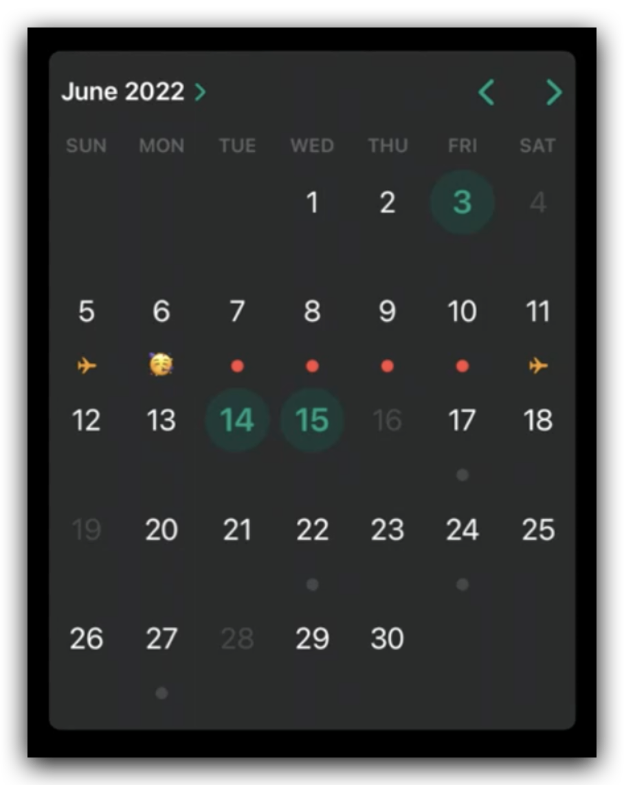
UICalendarView
之前一直希望 iOS 能够集成一个类似 FSCalendar 的日历组件,在 iOS 16上终于算是等到了。UICalendarView 是 UIDatePicker 的内联日历样式,它和 UIDatePicker 最主要的一个区别在于 UICalendarView 将日期表示为 NSDateComponents 而不是 NSDate。
UICalendarView现在作为一个独立的全功能组件形式提供,它具备了以下几种特性。
- 支持日期单选或多选
- 支持在范围内框选日期和禁用个别日期
- 支持对标注日期进行装饰
- 明确由哪个
NSCalendar表示
接下来尝试构建一个多选日期日历。
- 创建一个
UICalendarView对象,为其设置delegate并指定其calendar属性。如果需要采用农历,更改NSCalendar的初始化即可(Calendar(identifier: .chinese)) - 配置多日期选择需要创建一个
UICalendarSelectionMultiDate对象,并为其selectedDates属性进行赋值,再将此对象作为selectionBehavior属性传给我们创建的UICalendarView对象 - 通过
UICalendarViewDelegate中的multidateselect: canSelectDate:方法可以控制哪些日期可以被选择,如防止日历中选中单个日期。无法选择的日期会被置灰。
// Configuring a calendar view with multi-date selection

let calendarView = UICalendarView()
calendarView.delegate = self
calendarView.calendar = Calendar(identifier: .gregorian)
view.addSubview(calendarView)

let multiDateSelection = UICalendarSelectionMultiDate(delegate: self)
multiDateSelection.selectedDates = myDatabase.selectedDates()
calendarView.selectionBehavior = multiDateSelection

func multiDateSelection(
    _ selection: UICalendarSelectionMultiDate,
    canSelectDate dateComponents: DateComponents
) -> Bool {
    return myDatabase.hasAvailabilities(for: dateComponents)
}
UICalendarViewDelegate 提供了 calendarView: decorationForDateComponents: 方法对日历中的日期进行装饰。
- 如果不需要装饰直接返回 nil 即可
- 可以通过简单的图像构造装饰日期
- 可以通过自定义视图装饰日期
- 自定义装饰视图不允许交互
// Configuring Decorations
func calendarView(
    _ calendarView: UICalendarView,
    decorationFor dateComponents: DateComponents
) -> UICalendarView.Decoration? {
    switch myDatabase.eventType(on: dateComponents) {
    case .none:
        return nil
    case .busy:
        return .default()
    case .travel:
        return .image(airplaneImage, color: .systemOrange)
    case .party:
        return .customView {
            MyPartyEmojiLabel()
        }
    }
}
导航栏提升
UINavigationItemStyle
新引入了 Browser、Editor 两种导航样式,目前支持的UINavigationItemStyle 有以下几种
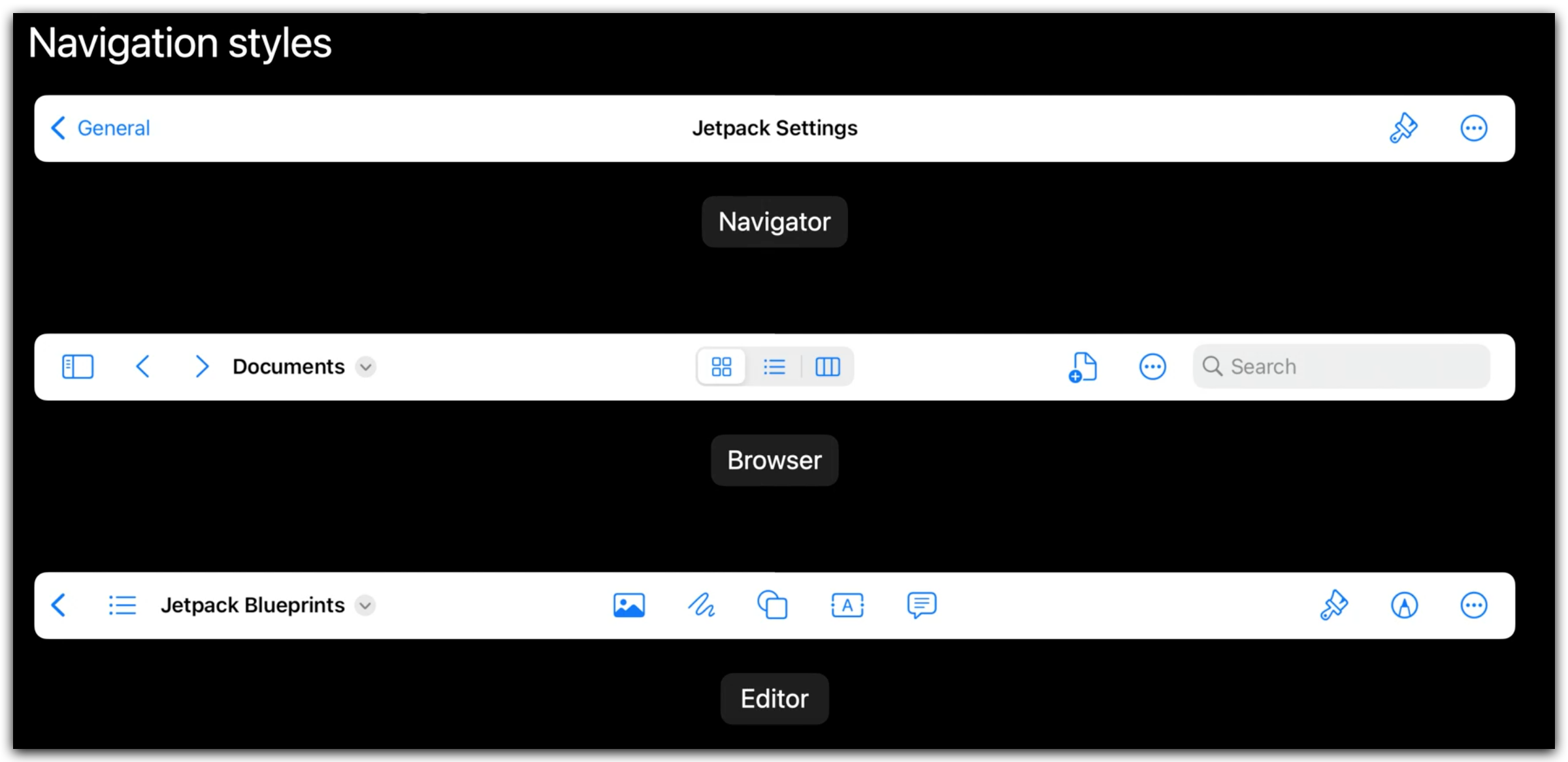
Navigator:遵循传统的 push / pop 模型,如设置appBrowser:使用历史记录或文件夹结构导航,如 Safari、系统文件appEditor:导航栏中间为文件相关操作,标题则在最左边
// Adopt the editor navigation style for the navigation item.
navigationItem.style = .editor
Center Items
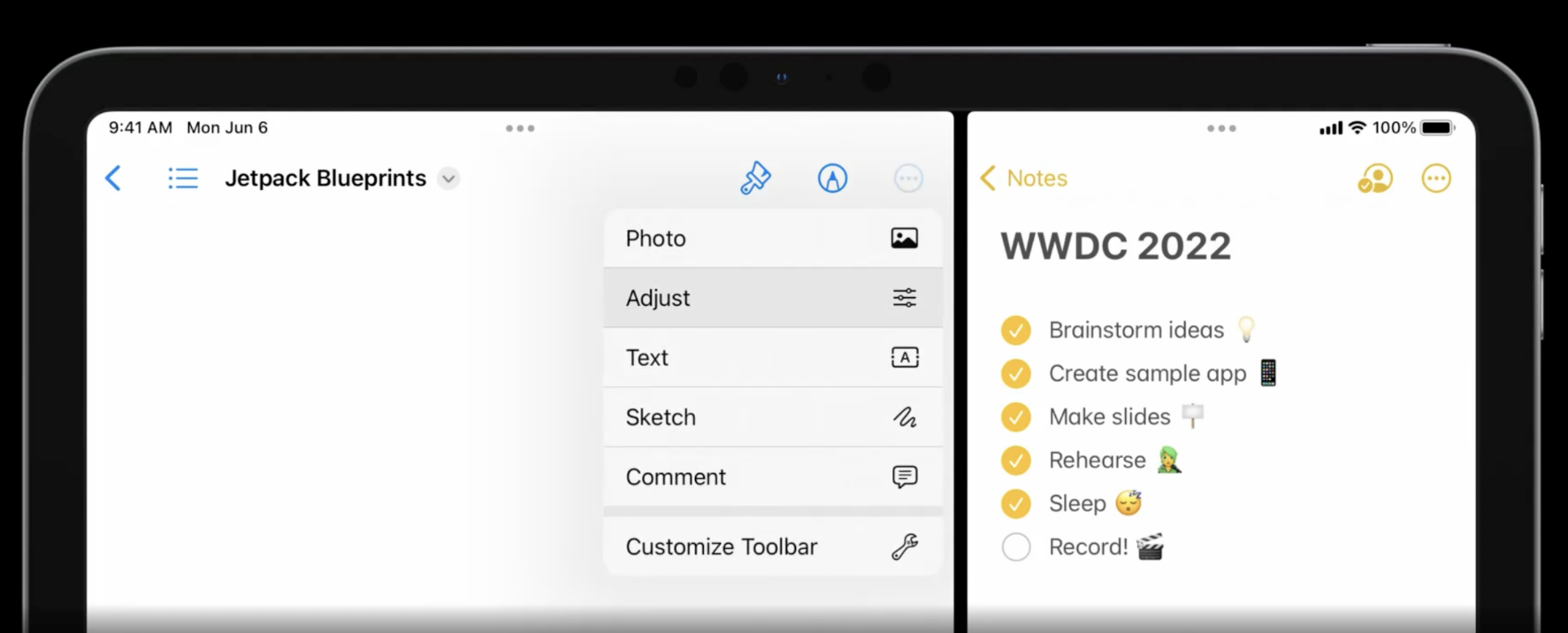
center items 是展示在导航栏中间的的控件组,能够提供对应用程序最重要功能的快速访问。
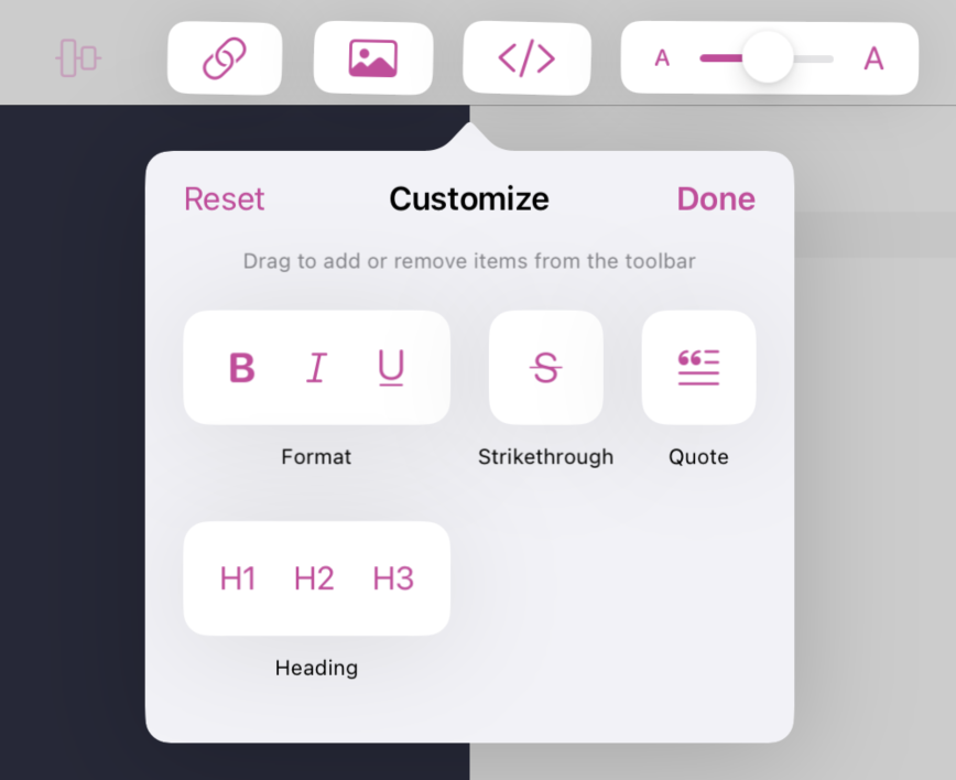
用户可以移动、移除或添加来定制导航栏的 center items。默认不展示的 center items 出现在自定义弹出窗口中,可以通过点击更多按钮中的 Customize Toolbar 菜单访问。
为了实现这一能力,应用程序需要为导航项的customizationIdentifier属性提供一个字符串,UIKit 能够根据这个 identifier 自动保存和恢复用户自定义设定。
/// Setting a non-nil customizationIdentifier enables customization and UIKit will automatically save & restore customizations based on this identifier. The identifier must be unique within the scope of the application.
    @available(iOS 16.0, *)
    open var customizationIdentifier: String?

// Set a customizationIdentifier and add center item groups.
navigationItem.customizationIdentifier = "editorViewCustomization"
配置 center Items 需要为 navigationItem.centerItemGroups 属性赋值
- 若需创建用户无法移动或移除的 item,需要调用
UIBarButtonItem的实例方法createFixedGroup() - 若需创建可调整的
BarButtonItemGroup- 拟定
customizationIdentifier作为唯一标识 UIBarButtonItems一次只能在一个UIBarButtonItemGroup中- 将一个 bar button item添加到一个 group 中会将其从之前的任何 group 中移除
isInDefaultCustomization属性设置默认是否出现在导航栏中BarButtonItemGroup通常包含多个可以提供定制能力的UIAction
- 拟定
/// Create a fixed group containing this bar button item. UIBarButtonItems may only be in a single UIBarButtonItemGroup at a time, adding a bar button item to a group removes it from any previous group.
    @available(iOS 16.0, *)
    open func creatingFixedGroup() -> UIBarButtonItemGroup

/// Create an optional BarButtonItemGroup containing only this bar button item. UIBarButtonItems may only be in a single UIBarButtonItemGroup at a time, adding a bar button item to a group removes it from any previous group.
    @available(iOS 16.0, *)
    @available(tvOS, unavailable)
    @available(watchOS, unavailable)
    @MainActor public func creatingOptionalGroup(customizationIdentifier: String, isInDefaultCustomization: Bool = true) -> UIBarButtonItemGroup

private func configureCenterItemGroups() {

					navigationItem.centerItemGroups = [
            UIBarButtonItem(primaryAction: UIAction(title: "Sync Scrolling", image: syncScrollingImage) { [unowned self] action in
                syncScrolling.toggle()
                if let barButtonItem = action.sender as? UIBarButtonItem {
                    barButtonItem.image = syncScrollingImage
                }
            }).creatingFixedGroup(),

           UIBarButtonItem(primaryAction: UIAction(title: "Add Link", image: UIImage(systemName: "link")) { [unowned self] _ in
                insertTag(.link)
            }).creatingOptionalGroup(customizationIdentifier: "addLink")
					],

					UIBarButtonItem(title: "Insert Image", image: UIImage(systemName: "photo"), menu: UIMenu(title: "Insert Image", children: [
                UIAction(title: "From Photo Library", image: UIImage(systemName: "photo.on.rectangle")) { [unowned self] _ in
                    let picker = UIImagePickerController()
                    picker.delegate = self
                    present(picker, animated: true)
                },
                UIAction(title: "From File", image: UIImage(systemName: "folder")) { [unowned self] _ in
                    let picker = UIDocumentPickerViewController(forOpeningContentTypes: [.image], asCopy: true)
                    picker.delegate = self
                    isPickingImageFromFile = true
                    present(picker, animated: true)
                },
                UIAction(title: "Blank Image Tag", image: UIImage(systemName: "tag")) { [unowned self] _ in
                    insertTag(.image)
                }
            ])).creatingOptionalGroup(customizationIdentifier: "addImage")
}
center items 针对 Mac Catalyst 的 NSToolbar 和 iPad 并排模式能够实现自动适配。
文件菜单
当用户点击导航项目的标题时会出现文件菜单,从上到下可以将其拆分成三部分
- Document header:包含文件名、文件类型、文件大小、分享菜单等
- Suggested title menu:与当前文档相关的建议操作
- Custom title menu:自定义操作
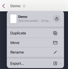
Document header
Document header 显示当前文档相关的信息,包括标题、文件类型和大小,还提供了分享或拖放文档的能力。
@available(iOS 16.0, *)
@MainActor open class UIDocumentProperties : NSObject {


    /// When initializing with a url, UIKit will automatically lookup metadata based on the data at that url.
    public init(url: URL)


    /// Initialize with metadata directly when the item is not backed by a url.
    public init(metadata: LPLinkMetadata)


    /// The metadata to use. UIKit will generate this automatically if a url is given at initialization time.
    @NSCopying open var metadata: LPLinkMetadata


    /// To support drag & drop, assign a closure to return an array of drag items corresponding to the represented document.
    open var dragItemsProvider: ((UIDragSession) -> [UIDragItem])?


    /// To support sharing, assign a closure to return a UIActivityViewController configured to share the represented document.
    open var activityViewControllerProvider: (() -> UIActivityViewController)?


    /// If enabled, shows an icon representation of the document in the navigation bar.
    open var wantsIconRepresentation: Bool
}
如果需要Document header相关能力**,**使用UIDocumentProperties 对象给navigationItem.documentProperties属性赋值即可。
let documentProperties = UIDocumentProperties(url: document.fileURL)
if let itemProvider = NSItemProvider(contentsOf: document.fileURL) {
    documentProperties.dragItemsProvider = { _ in
        [UIDragItem(itemProvider: itemProvider)]
    }
    documentProperties.activityViewControllerProvider = {
        UIActivityViewController(activityItems: [itemProvider], applicationActivities: nil)
    }
}

navigationItem.title = document.localizedName
navigationItem.documentProperties = documentProperties
Title Menu
配置 title menu 需要给 navigationItem.titleMenuProvider 返回菜单 closure。系统返回给closure了一组 suggested actions,包括移动和复制;应用定义了动作包括文档导出为 HTML 和 PDF。
/// When non-nil, UIKit will generate suggestedActions and call this block to generate a menu that is displayed from the title.
    @available(iOS 16.0, *)
    open var titleMenuProvider: (([UIMenuElement]) -> UIMenu?)?

navigationItem.titleMenuProvider = { suggested in
    let custom = [
        UIMenu(title: "Export…", image: UIImage(systemName: "arrow.up.forward.square"), children: [
            UIAction(title: "HTML", image: UIImage(systemName: "safari")) { [unowned self] _ in
                previewView.exportAsWebArchive(named: document.localizedName, presenter: self)
            },
            UIAction(title: "PDF", image: UIImage(systemName: "doc.richtext")) { [unowned self] _ in
                previewView.exportAsPDF(named: document.localizedName, presenter: self)
            }
        ])
    ]
    return UIMenu(children: suggested + custom)
}UINavigationItem提供了对文件重命名的支持。
public protocol UINavigationItemRenameDelegate : AnyObject {

    /// This method is called when renaming has ended. The title on the navigation item has already been changed when this method is called but
    /// clients can make further adjustments to it when necessary.
    func navigationItem(_: UINavigationItem, didEndRenamingWith title: String)

    /// Controls whether the rename action is supported for the given navigation item. For example this method is called when the navigation bar's
    /// document menu is shown to validate if the rename action should be part of that menu.
    func navigationItemShouldBeginRenaming(_: UINavigationItem) -> Bool

    /// Called when we begin renaming. Implementing this method allows for customizing the initial text that will show up in the text field as well as the
    /// selected range of that text.
    func navigationItem(_: UINavigationItem, willBeginRenamingWith suggestedTitle: String, selectedRange: Range<String.Index>) -> (String, Range<String.Index>)

    /// This method can be used to prevent renaming from happening. However there are cases (e.g. when a new navigation item is pushed on the navigation
    /// bar) where this method will not be called and instead navigationItem:didEndRenamingWithTitle: is called right away. Clients are therefore expected to
    /// handle titles in navigationItem:didEndRenamingWithTitle: for which they would return NO from navigationItem:shouldEndRenamingWithTitle:.
    func navigationItem(_: UINavigationItem, shouldEndRenamingWith title: String) -> Bool
}启用该能力需要遵循UINavigationItemRenameDelegate,并使用 navigationItem.renameDelegate 绑定到 self。
navigationItem.renameDelegate = self体验提升
如果你对这部分内容感兴趣可以移步此Session
Find and Replace
UITextView、WKWebView、PDFView 都支持了系统层级的查找与替换功能。
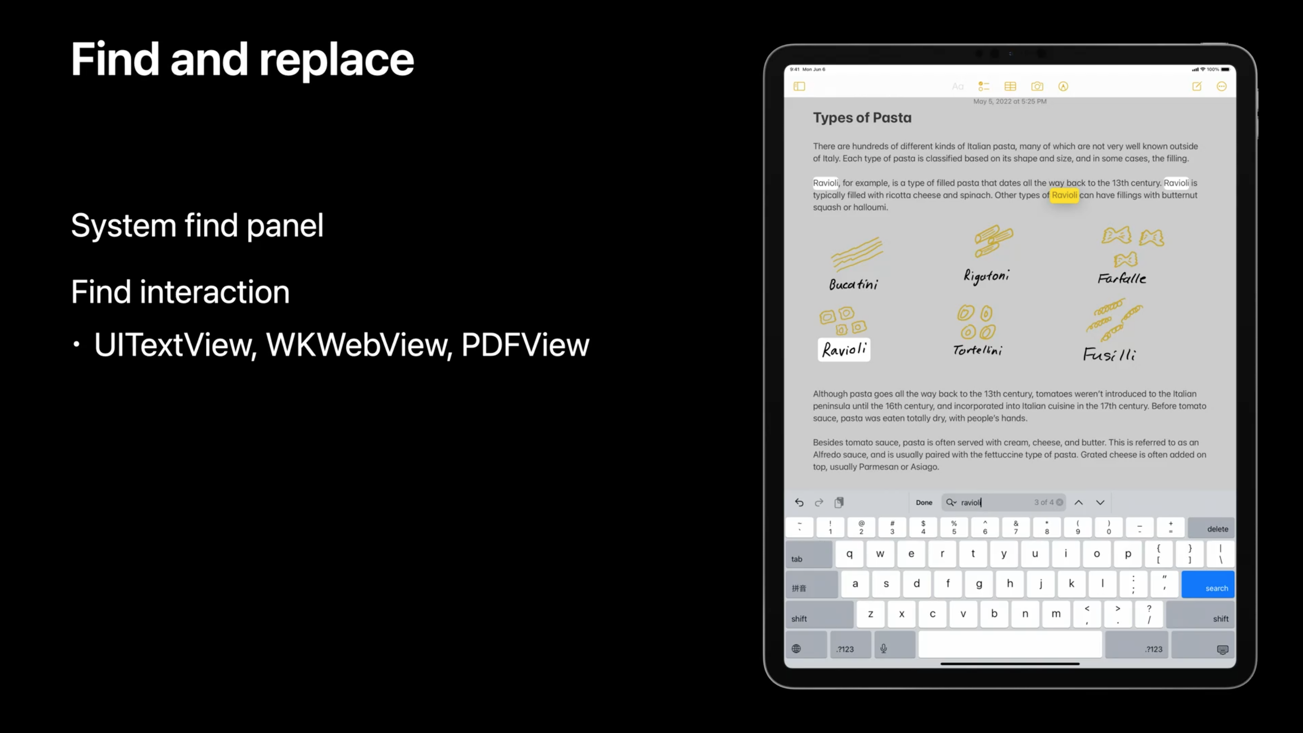
如果你在开发中的视图是上述 View 的子类,如editorTextView 是UITextView 的子类,启用查找和替换只需要一行代码。
editorTextView.isFindInteractionEnabled = trueUIEditMenu
Edit menu 交互菜单能够针对当前展示的内容提供诸如剪切、粘贴和粘贴等编辑动作。系统会针对当前用户的交互方式提供符合交互的菜单展示形式。
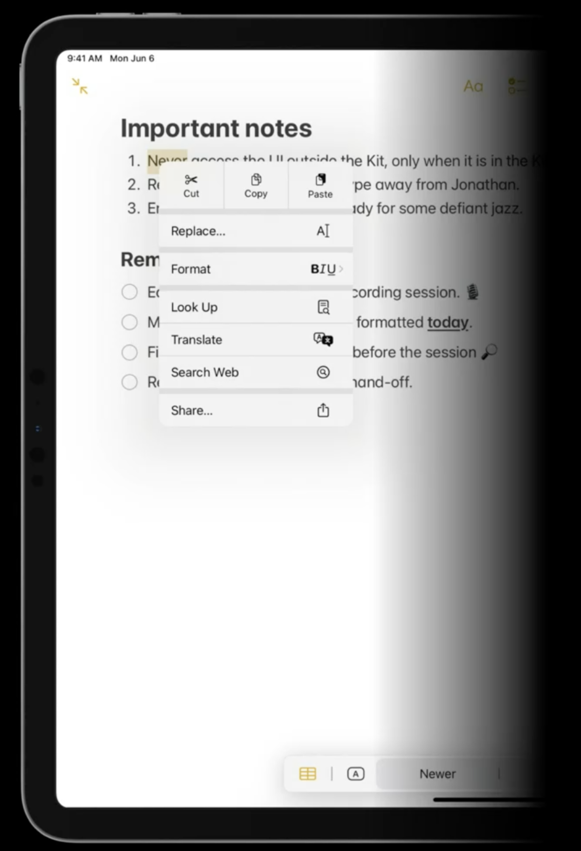
- 对于触摸交互,动作以 editing menu 的形式展示
- 对于指针的交互,动作以 context menu的形式展示
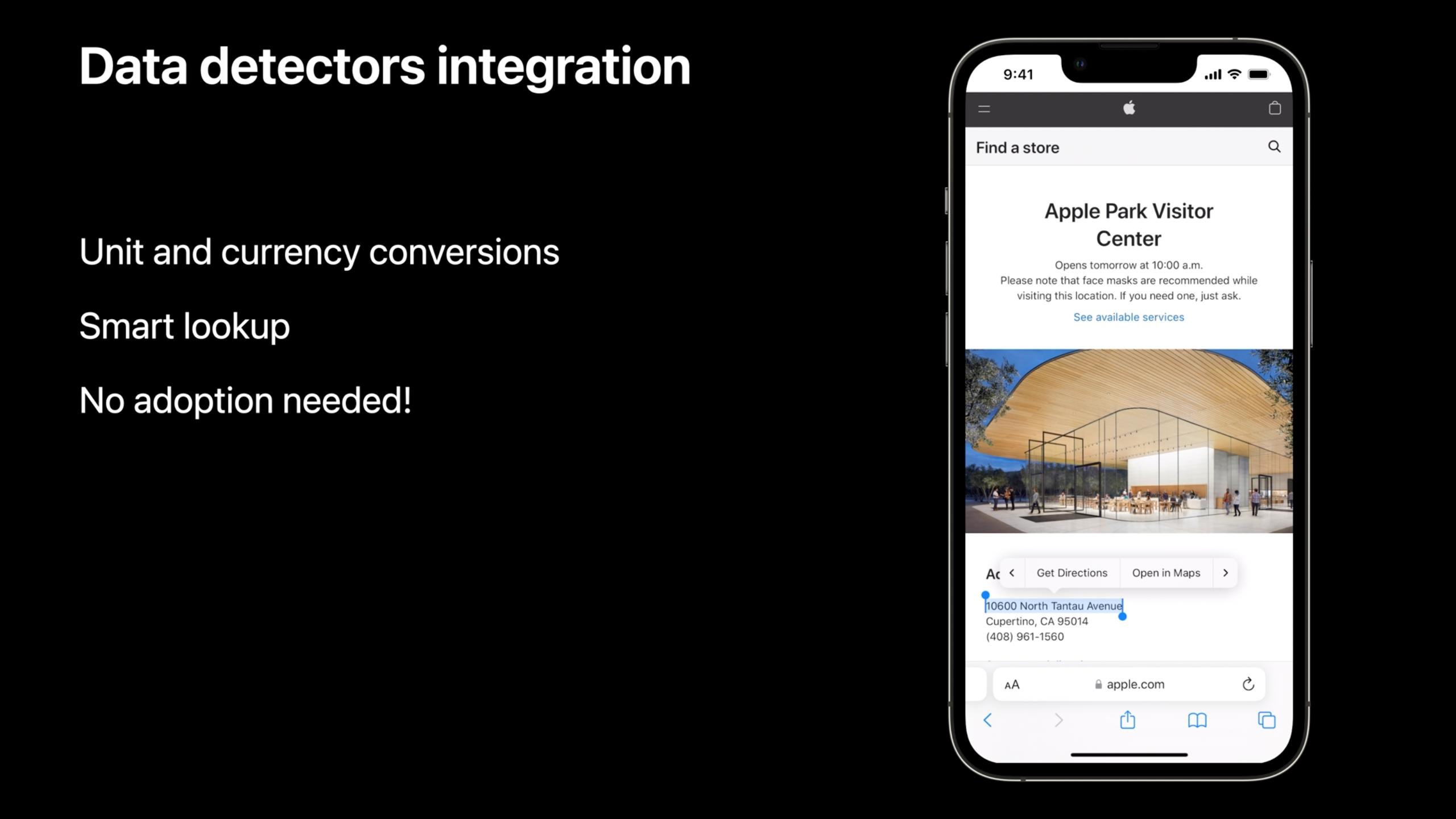
标准的 UIKit 类,如 UITextView 或者 UITextField,已经预先支持了Edit Menu交互,你可以便捷地框选一个地址然后获得类似地图导航的交互菜单选项。
在通用视图中添加 Edit menu 交互菜单
- 创建一个 Edit menu 交互对象,并在默认 initializer 传入一个可选的 delegate。
- 在视图上调用
addInteraction(_:)来添加交互对象 - 创建一个 gesture recognizer 来触发交互,并将其添加到视图中
以下苹果提供的例子中创建了一个由长按触发的 Edit menu 交互菜单。
override func viewDidLoad() {
    super.viewDidLoad()

    // Add the edit menu interaction.
    editMenuInteraction = UIEditMenuInteraction(delegate: self)
    interactionView.addInteraction(editMenuInteraction!)

    // Create the gesture recognizer.
    let longPress = UILongPressGestureRecognizer(target: self, action: #selector(didLongPress(_:)))
    longPress.allowedTouchTypes = [UITouch.TouchType.direct.rawValue as NSNumber]
    interactionView.addGestureRecognizer(longPress)
}

@objc func didLongPress(_ recognizer: UIGestureRecognizer) {
    let location = recognizer.location(in: self.view)
    let configuration = UIEditMenuConfiguration(identifier: nil, sourcePoint: location)

    if let interaction = editMenuInteraction {
        // Present the edit menu interaction.
        interaction.presentEditMenu(with: configuration)
    }
}- Edit menu 交互菜单包括标准编辑操作,包括剪贴、复制、删除等等,可参考
UIResponderStandardEditActions。 - 可以使用
UIEditMenuInteractionDelegate提供的方法向Edit menu 交互菜单添加额外项目。 - 对于文本视图可以使用
UITextViewDelegate、UITextFieldDelegate或UITextInput中的方法为特定文本范围指定菜单显示的项目。
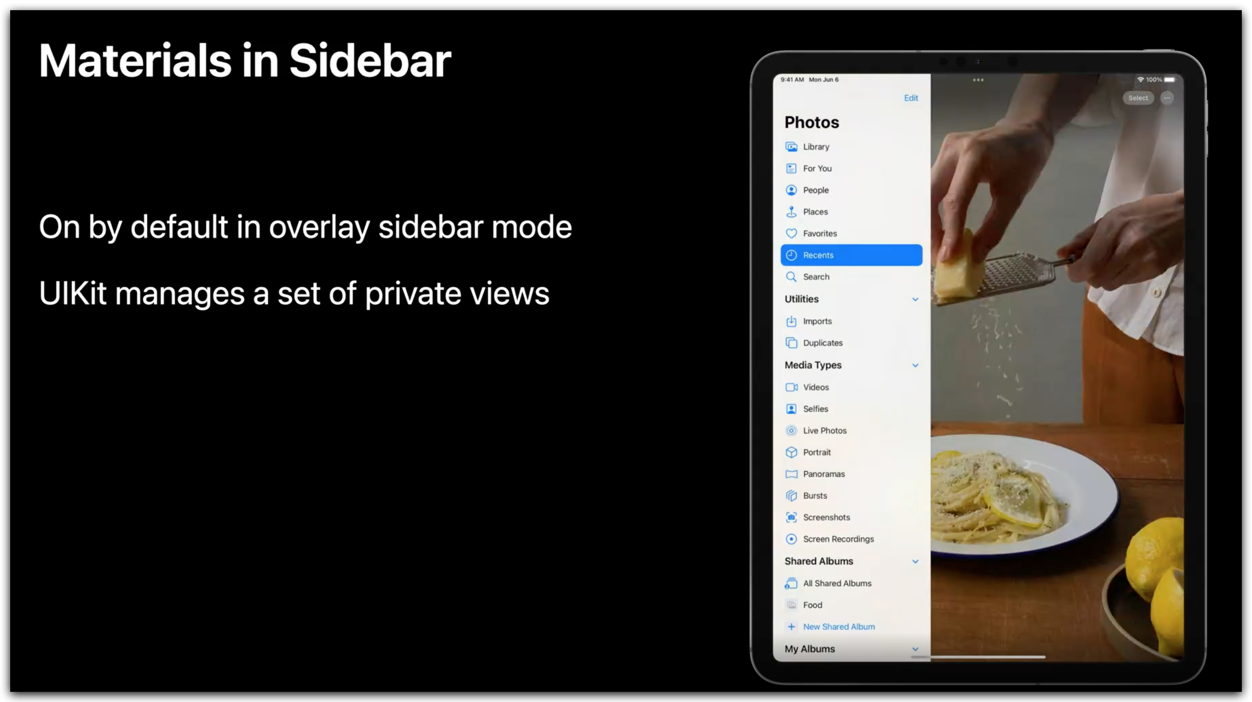
Sidebar
在 iOS 16 中,侧边栏会在 Slide-over(侧拉)模式下自动显示。UIKit 会管理一组私有视图。
SFSymbols
SFSymbols 在 iOS 16 上支持四种 renderingMode,分别是
- monochrome
- multicolor
- hierarchical
- palette
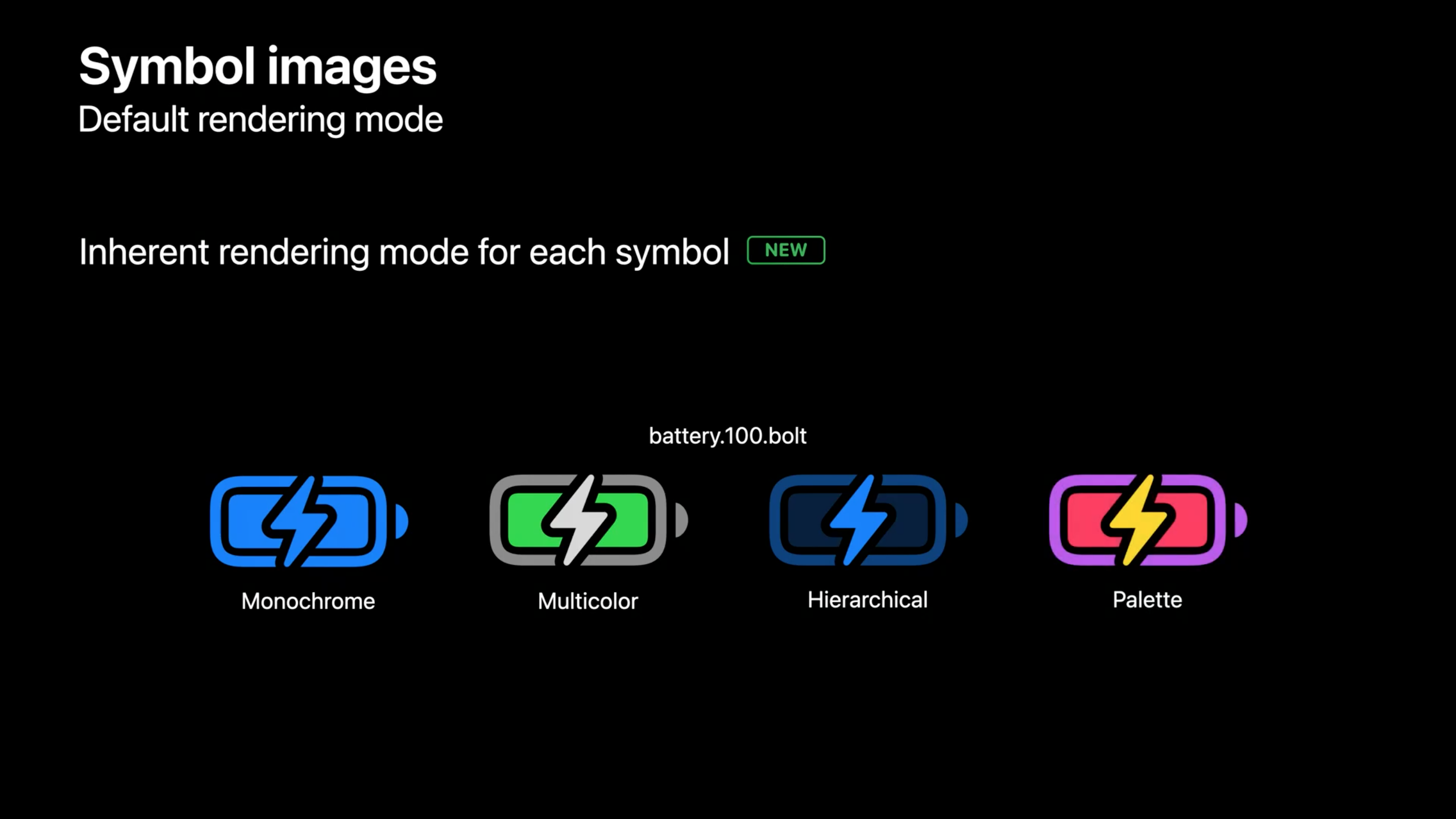
在 iOS 15 及之前的版本中,默认使用 monochrome 渲染 symbol。
在 iOS 16 如果没有指定renderingMode,默认使用 hierarchical 渲染 symbol,可以通过 UIImage.SymbolConfiguration.preferringMonochrome() 指定渲染方式。
同时增加了对可变 symbol 的支持,即支持根据从 0 到 1 的值变化映射 symbol 的变化,当然,这需要 symbol 自身支持该能力。
假设 App 使用了speaker.3.wave.fill 符号表示当前音量级别,在值为 0 时扬声器波纹消失表示最低音量水平,当该值增加到 1 时扬声器的波形逐渐填充完整,表示音量水平提高。
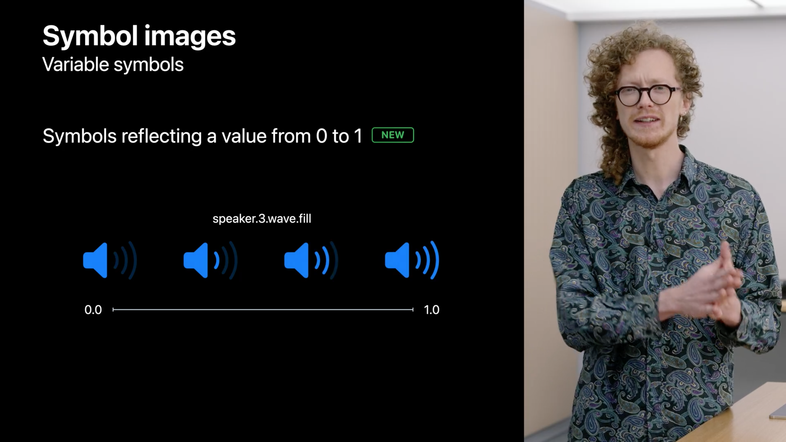
使用方法也非常简单直白,通过标准的 SF Symbols API 为 UIImage 设置 variableValue 参数即可,甚至将该属性与 renderingMode 组合使用以进一步设计符号的样式。
以下为 GitHub上 @ferhanakkan 的 Demo。
@objc private func sliderDidValueChange(_ sender: UISlider) {
        imageView.image = UIImage(
            systemName: "wifi",
            variableValue: Double(sender.value),
            configuration: UIImage.SymbolConfiguration(paletteColors: [.orange])
        )
    }
学习如何创建自定义变量符号可以观看 Adopt variable color in SF Symbols 和 What’s new in SF Symbols 4 这两个Session。
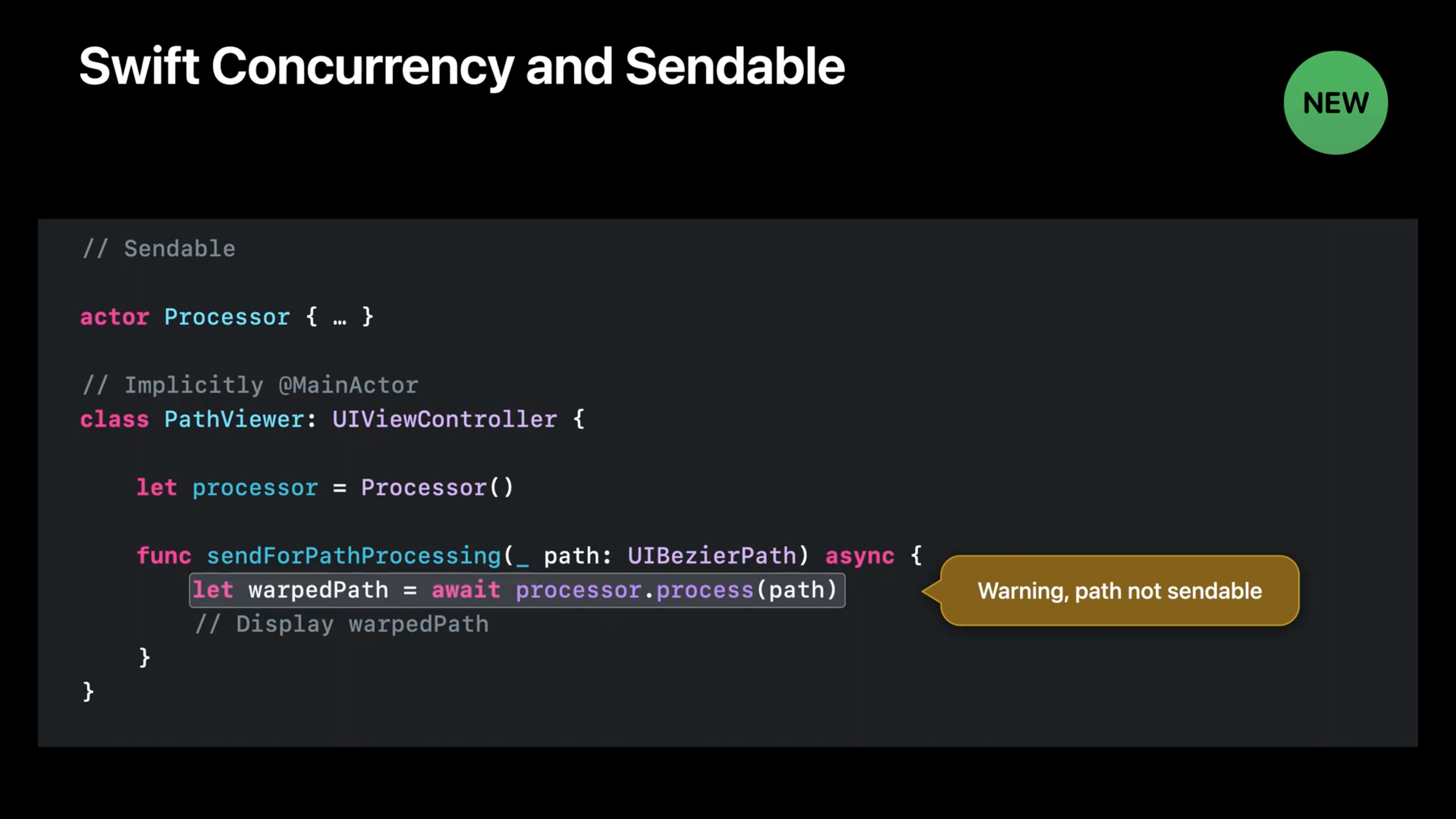
Swift Concurrency and Sendable
UIKit 现在可以与 Swift Concurrency 同时使用,包括 immutable 类型,如以下的类型遵循了 Sendable
UIImageUIColorUIFontUITraitCollection
对象可以在 MainActor 和自定义 actor 之间发送而不会收到编译器警告。
苹果提供的例子中,有一个叫做 Processor 的自定义 actor,以及一个被绑定到 MainActor 的叫做 ImageViewer 的 ViewController。在 sendImageForProcessing 方法中 ImageViewer 将图像发送给 Processor进行处理,目前是安全的。
因为 UIImage 是 immutable 类型, Processor 必须创建新的拷贝来执行操作。任何引用原始图像的代码都不会显示这些修改,共享状态也不会发生不安全的变化。
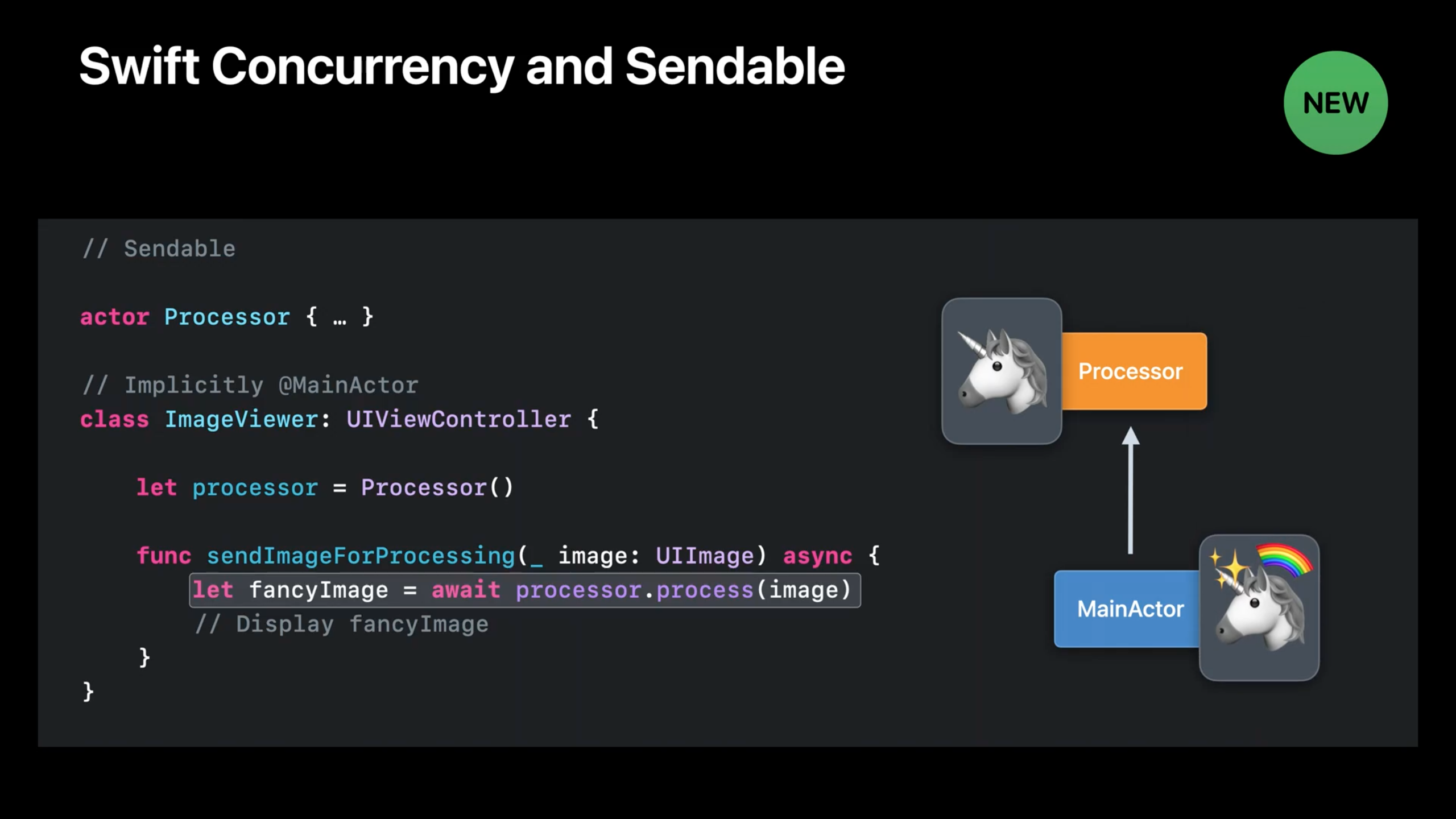
对比一下因为 mutable 而没有遵循 Sendable 的 UIBezierPath,以前只能在文档中表示,现在可以由编译器进行检查。
要了解更多关于 Sendable 和 Swift Concurrency 移步视频 Eliminate data races using Swift Concurrency 和 Visualize and optimize Swift Concurrency。
UIKit and SwiftUI
过去如果想要实现将 SwiftUI 视图嵌入 UIView 视图,一般需要这么做。
let controller = UIHostingController(rootView: SwiftUIView())
addChild(controller)
view.addSubview(controller.view)
controller.didMove(toParent: self)
在 iOS 16上推出了 UIHostingConfiguration ,你可以在 UICollectionView 和 UITableView 中以 contentConfiguration 的方式将 SwiftUI 构建的 View 嵌入 cell。
cell.contentConfiguration = UIHostingConfiguration {
    SwiftUIView()
}
结束语
最近几年的 WWDC 中看到苹果对于 UIKit 的理解,倡导使用 configuration 的方式构建组件、菜单,一方面参照人机交互指南构建组件能够确保交互不被滥用,另一方面降低了开发者的接入成本。
作为开发者,一起尝试兼容 app 到 iOS 16,适配新的API,探索新的业务可能性吧。